01
Eastman.com redesign.
Lead designer on the multi-year redesign of Eastman Chemical's flagship web platform: overhauling information architecture, the visual system, and the component library that scales across business units.
- Role
- Lead Designer
- Company
- Eastman Chemical Company
- Discipline
- UX/UI, Web, Visual System
Brief
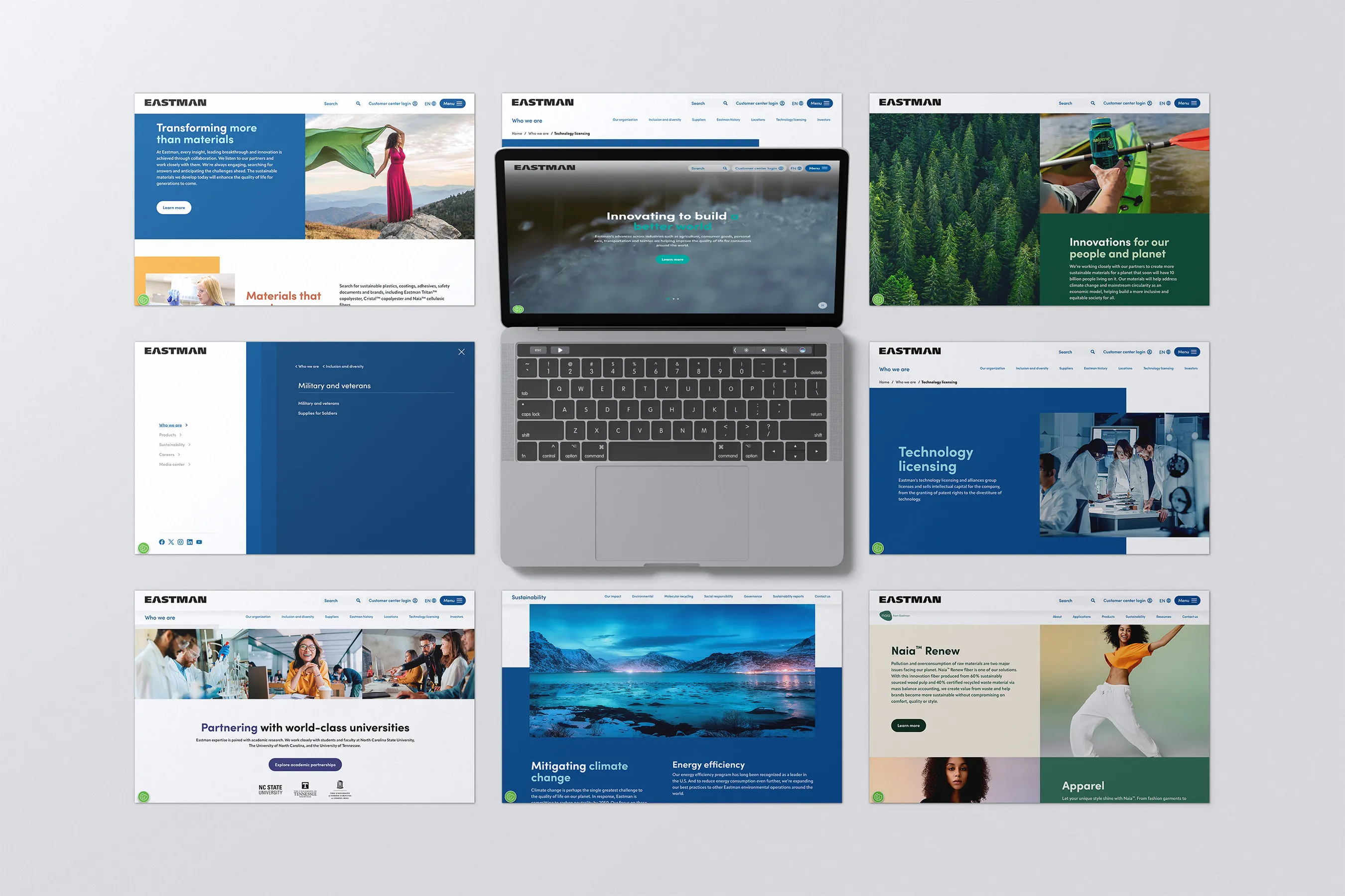
Eastman.com is the public face of a Fortune 500 specialty-materials company, serving everyone from technical buyers and sustainability researchers to investors and prospective hires. The previous site had grown inconsistent across Eastman’s many business units; navigation was complex; the visual system felt dated next to peers in the chemicals and materials space.
The redesign needed to do three things at once: simplify the front door for casual visitors, support technical depth for specialists, and create a system that could flex across very different business audiences without losing brand cohesion.
Role
I led visual design on the project in partnership with internal IT, a Deloitte consulting team, and an external design agency. Day-to-day work spanned information architecture, the visual system, and the component library that scaled across business units.
Visual system
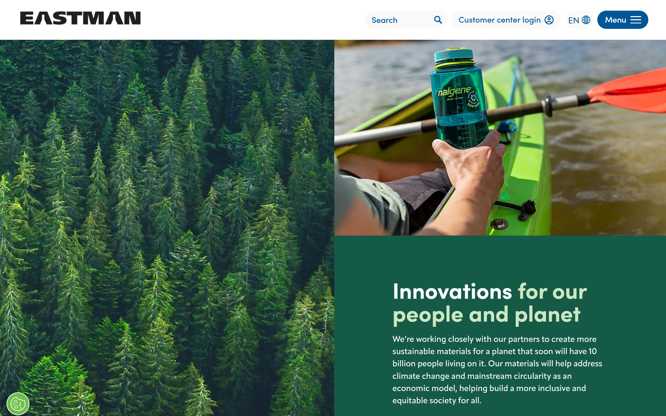
The visual system bridges Eastman’s roots in materials science with consumer-scale storytelling. Type, color, and a disciplined photography direction give the system enough range to carry both product-spec pages and brand-led campaigns.
Photography pairs human moments with the materials behind them (a silk scarf made from Naia™, a kayak built around recycled feedstocks), so visitors connect Eastman’s chemistry to outcomes they recognize.
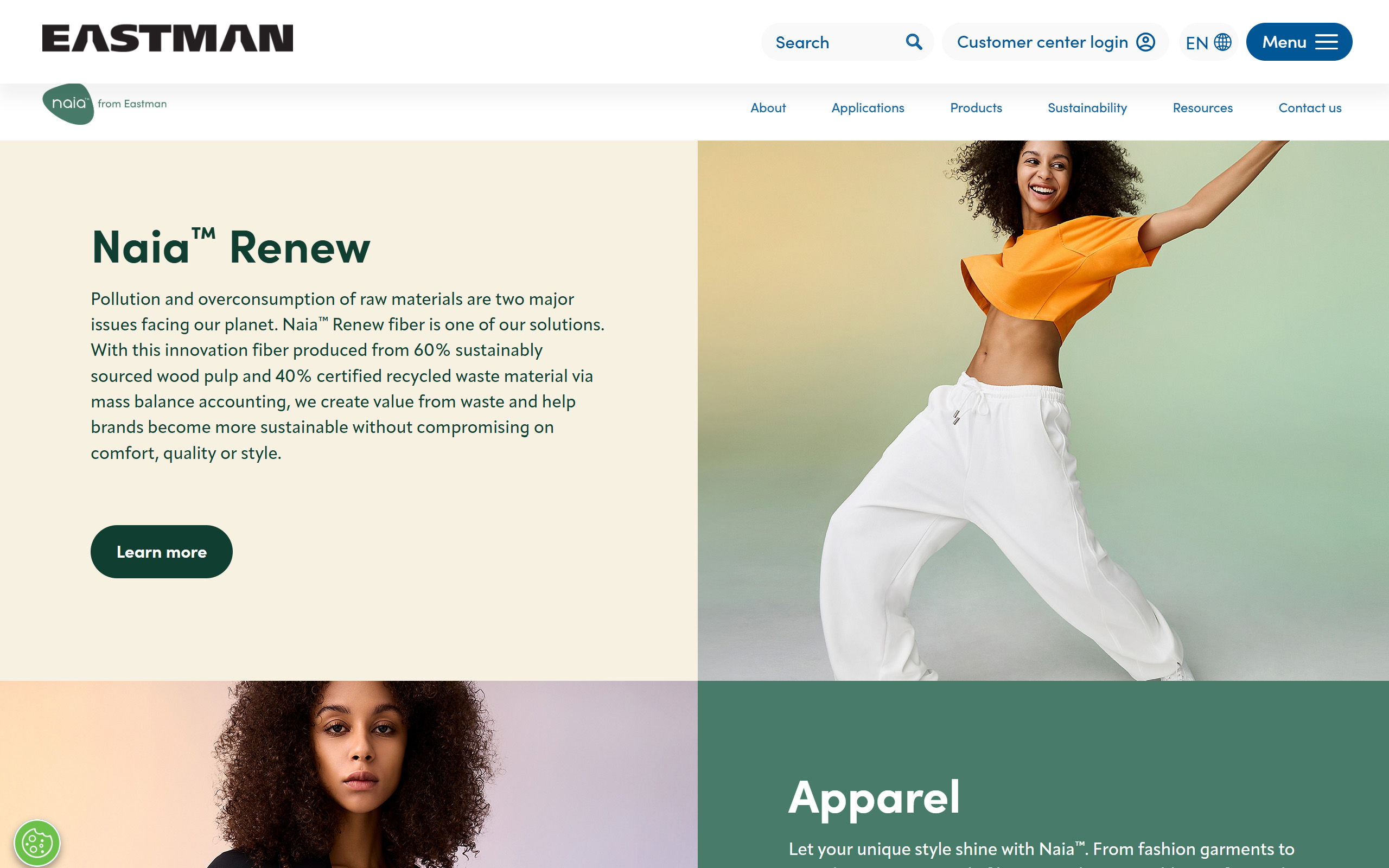
Sub-brands like Naia™ Renew adopt the parent system without breaking it: distinct color and tone for the consumer-facing fiber line, but typography, navigation, and page architecture stay anchored to Eastman.com. New business units can come online without rebuilding from scratch.
Information architecture
Eastman serves a wider audience than most B2B sites: chemists, manufacturers, fashion designers, sustainability officers, students, investors, and journalists. The IA work centered on giving each of those audiences a clear path in without burying the others.
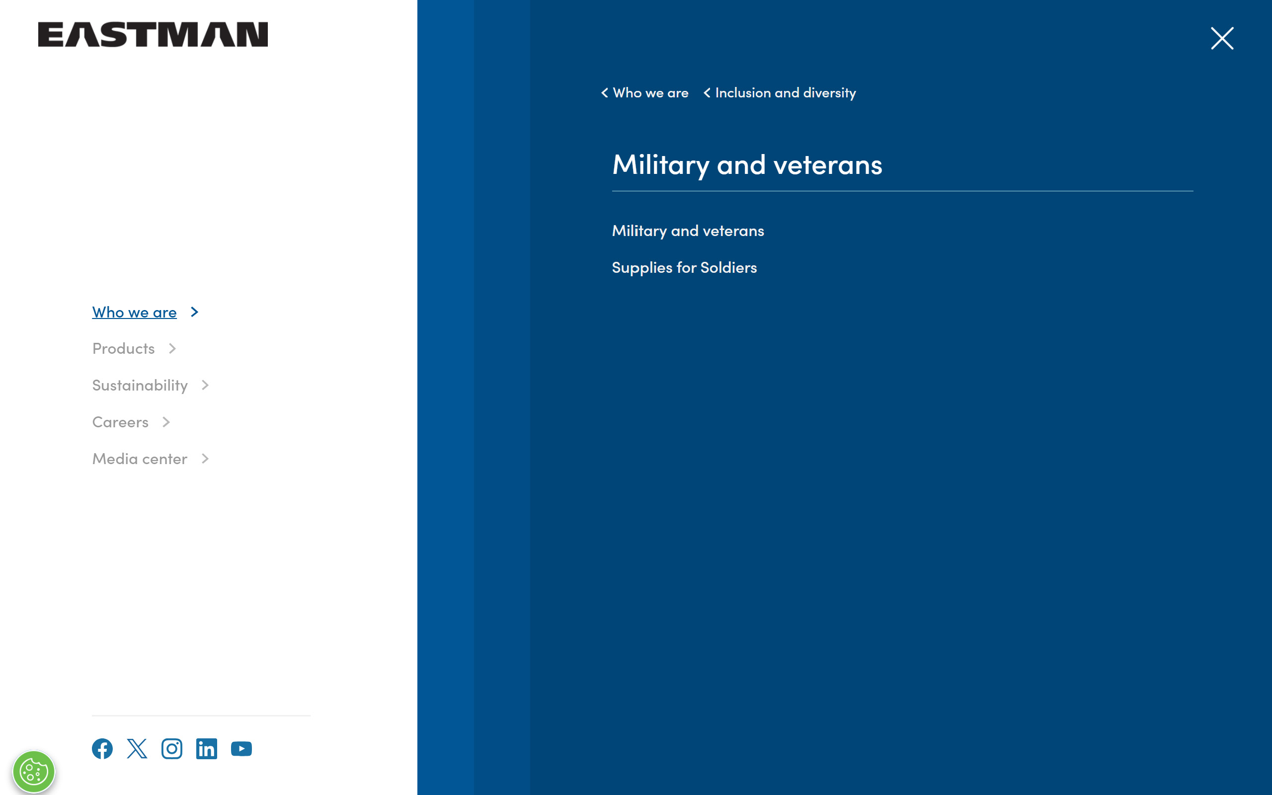
The mega-menu surfaces the depth of Eastman’s portfolio (products, markets, sustainability programs, careers) in a structure that scales as new business units come online.
A short walkthrough of the menu interaction: open, hover paths into sub-categories, and the back-stack pattern for deep navigation.
Component library
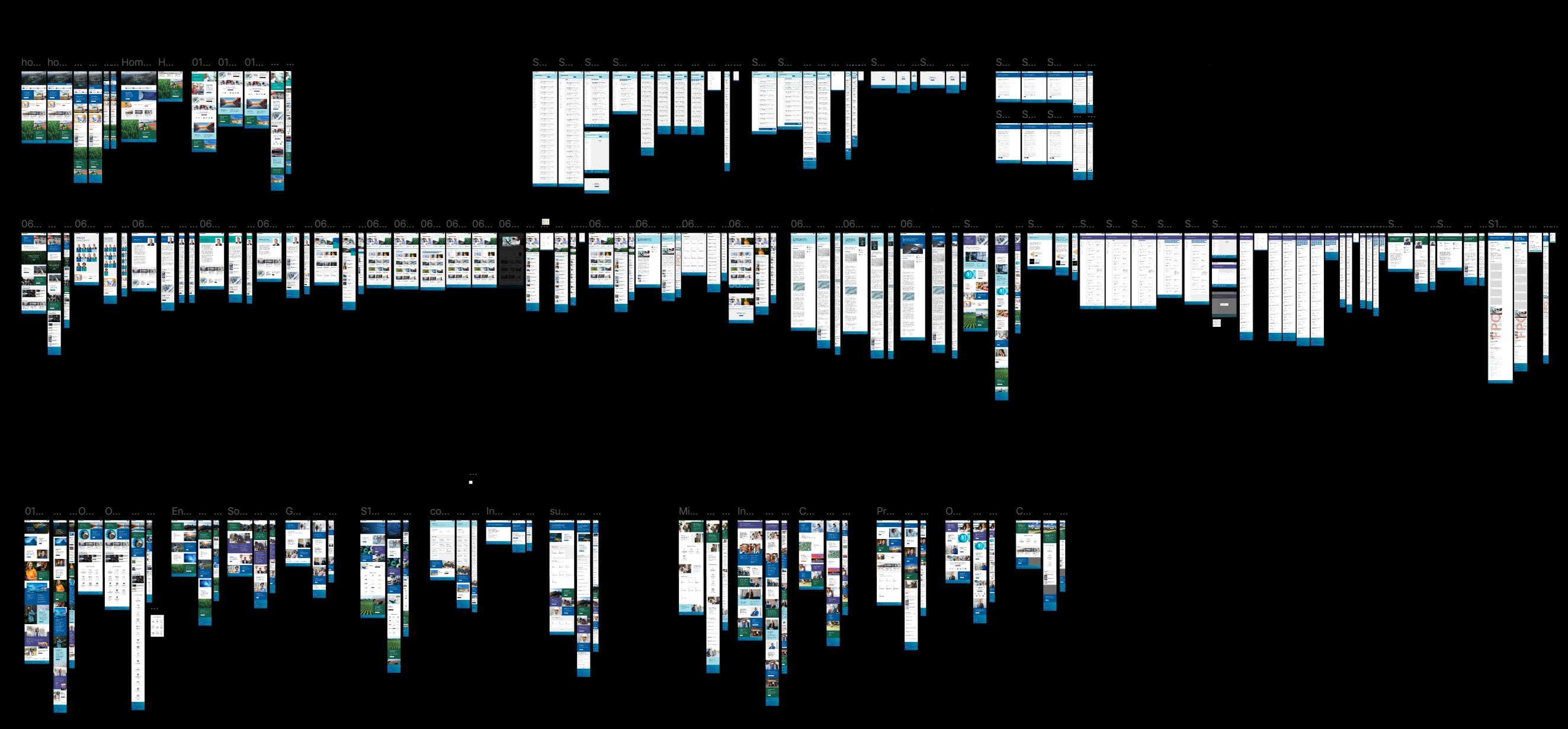
The component library was the spine of the project. Each business unit owns its own pages but pulls from a shared system of headers, section blocks, product cards, table styles, and CTAs, keeping the look unified without bottlenecking content updates.
Outcome
A unified visual system, IA, and component library shipped across Eastman’s business units, with the flexibility to support new sub-brands and campaigns.
Credits
- Eastman Chemical Company — internal IT, digital, brand, and content teams across business units
- Deloitte — consulting partner
- External design agency — creative partner